Education Employment Per Capita

Monday, March 7, 2016

0 comments
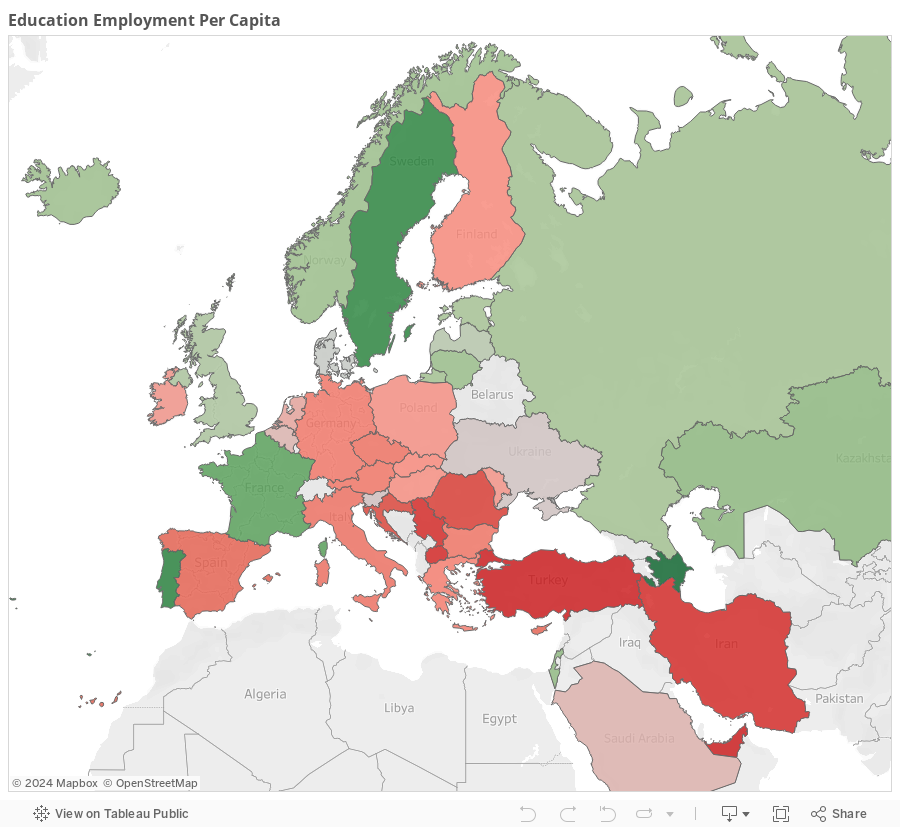
Here is a Tableau Geographic chart I put together showing the dispersion of employment of educators. This chart is mainly focused on European countries. The green represents countries that employ an average to high number of educators (teachers, professors, etc) per capita. The red represents those counties that employ a below average number of educators per capita.

For example Azerbaijan employs the most educators per capita. There are other countries listed if you pan out, but they are limited in number since the data I had to work with was somewhat limited.

Business Intelligence Project: Cybertron PC Sentiment Analysis

Monday, November 2, 2015

0 comments


Summary

The sentiment analysis of the customer reviews for CybertronPC was done using a text mining and sentiment analysis package in the R program. Two tests were done to get a sense of the overall customer view of CybertronPC’s products. The Tableau infographic provides a brief summary of the analysis.

Underground Baseball: Evaluating General Managers & Front Offices Visualized

0 comments
Read the corresponding article(s) at Banished to the Pen. Part 1 and Part 2

Refugees in Pakistan

Thursday, October 29, 2015

0 comments
This is a Tableau project I executed to look at the problem of refugees in Pakistan.


Popular Posts

Powered by Blogger.